
by Trey Plante ’24
This past semester I took Working with Remote Sensing Data (QAC234) and developed a project focused on counting container ships in the Long Beach Harbor, California. Here are some details of what I did.
QAC234 is a new course, first offered in the fall of 2021. In the class, you learn what remote sensing is, how satellites collect data, and how this data can answer various research questions. We utilized Google Earth Engine, which is an online platform that stores satellite data for scientific analysis, to explore complex questions and garner intriguing insights via data science.
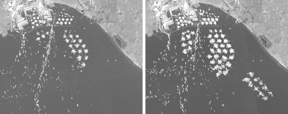
Having read a lot about the recent supply chain and port backlogs that have occurred post-COVID (see here and here), Professor Oleinikov and I decided to analyze the LA-Long Beach ports and developed a script for counting the number of ships in satellite imagery. We used the data from the Sentinel-1-GRD collection that comes from the Sentinel-1 satellite operated by the European Union and is available in the Earth Engine. Sentinel-1 is a synthetic aperture radar (SAR) – it can collect data in any weather conditions, day and night. It revisits the Long Beach area every six days.
To count the ships, we used the scripting capabilities in Google Earth Engine – all operations are done in the cloud, controlled by a script running from a web browser. Before we could actually count the ships, we had to learn how to separate them from the background. This operation is familiar to many of us: this is how the background filters work in Zoom and why movie-makers use green screen when they want to have an artificial background.

In our case, we needed to identify all pixels that corresponded to water (in contrast to land). Fortunately, water appears relatively dark in near-infrared imagery, while other types of surfaces appear brighter. We computed the historical minimum of the pixels in the images and then picked the ones whose value was below a threshold. This gave us a water mask – it is an image that masks out the pixels that should not be used in the analysis – the land pixels.

After ensuring that we are only working with the water region, we used the SAR data. SAR images capture the “roughness” of a surface – smooth surfaces will appear dark, while rough surfaces and structures on them will reflect the radio waves back to the radar and will appear brighter. In SAR, ships appear as bright spots on the dark background of water. We use thresholding again: pixels that are too dark to be ships are coded as 0, and pixels bright enough are 1. Next, we perform image dilation to seal the gaps between pixels. Then, we assign labels to the ship-related pixels and filter the labeled objects to be at least 1,000 square meters in area. One thousand square meters sounds like a lot, but it is actually only a rectangle 20 meters wide and 50 meters long, which is quite small for the average container ship. Finally, we count the number of labeled objects and export our data.

Our area of interest for applying this process was the Long Beach – LA Ports. The Long Beach – LA Ports are a huge gateway for US trade and have been backlogged with ships for months. The ports couldn’t cope with the resurgence in shipping activity after the end of COVID lockdown restrictions. The backlog is now considered one of the worst cases of supply chain congestion in the current supply chain crisis.
Our results are slightly different than the data published by the Marine Exchange of Southern California. One explanation for this is the difference in definitions: the Marine Exchange reported the numbers for an area within 40 miles from the ports of Los Angeles and Long Beach, while we used a smaller area. Qualitatively, we capture the same trends. In particular, the number of ships waiting for unloading in September 2021 is very close to the one reported by the Los Angeles Times. Generally, tracking traffic through ports and shipping lanes is difficult; even the most advanced tracking systems are imperfect and a considerable amount of maritime research goes towards their improvement.
Going forward, this project has lots of areas for improvement, from improving the parameters of the counting script to exploring new areas of maritime activity, like other ports and shipping lanes experiencing congestion. For example, changing the size of what we consider to be ships drastically changes the results of the counter, and is actually pretty hard to account for because container ships come in varying sizes. Moreover, the isolation of the area of water is suboptimal because it is based on a manually chosen threshold value (a method for resolving this can be read about here). I hope to expand the area of analysis and improve the project through incremental updates. Lastly, I’d like to thank Professor Oleinikov for making this project possible.
