Transparency is a hot issue; in politics, in business, and in journalism, people are all itching to know how truthful the truths their being fed really are. However, truth is no longer as easy a thing to gauge as it once was. It turns out, the public can be fed information that is, technically, true, yet at the same time only one version of the truth.
A good example to look at is weather forecasts. Most people think of weather as easy and straight-forward data to access. There are tons of websites that allow search by location (eg/ www.weather.com), and on TV news we can be given an explanation of a weather chart, as seen below:
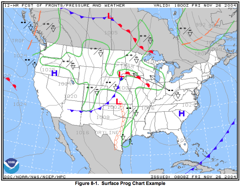
However, I recently learned that there is another form of weather forecasts available to the public that is more detailed than those shown on news channel: Aviation weather charts. Intended to help pilots forecast whether or not it will be safe for them to fly, these charts are a lot more detailed, and may show weather possibilities that aren’t included in the forecast broadcasted to the public. Check out the one below:

Can you already see the difference in detail between the two? While it is understandable that pilots have a much greater need for detailed and accurate forecasts, is there a good reason for that much information to be hidden from the public? Comprehension could be an issue; most of the public wouldn’t know how to decipher one of these charts. But, arguably, the same is true of normal weather charts – understanding them is a skill that is learned through weather reporters on TV and detailed descriptions.
This poses the question of why the public gets a simplified version. And, considering how much is excluded from that version, could it be considered a lie? The line has been thinned, then blurred, then smudged until invisible.
Besides looking at this from the angle of the consumer, it is also very important to think about this as a data analyst. Is there is a transparency protocol that we are meant to follow? Are we meant to hide something?
What must be looked at here are the conclusions that we want a viewer to make from a visualization (and this is assuming that we do, subconsciously, always want a viewer to come away with one of a finite number of possible conclusions). If this is the case, is this truthful? Is this fair? Should the viewers know that they’re being manipulated in some way? That the weather forecast they are viewing has been simplified based on the risk of weather-dependent activities they are planning, assuming that the risk is less than that of flying a plane?
The truth is that any story, whether a visual or written narrative, includes simplifications. We simplify to emphasize to prove a point. There is always more information than is visible; there is always more digging that could be done. This insinuates that based on an audience, there is an assigned end. For weather forecasts for the public, they only need to know a hesitant conclusion. For pilots, the need for transparency is more dire. For a student doing a project on weather patterns, they would have to dig more to get their hands on the more truthful truth.
It shouldn’t be news that data visualizations will always have layers. Weather forecasts are just one example, and this kind of investigation could be done with every data project out there. So transparency must be something that sticks in the back of our minds as we work, and we must be prepared for these questions, and sometimes complaints, from the public to arise.